About Woori
Corporate Identity
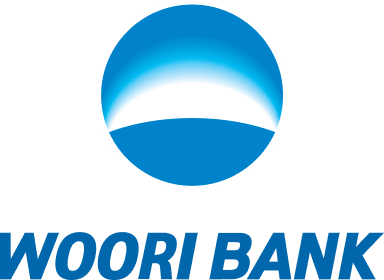
Symbol Mark
A dawn symbolizing challenge and hope
Woori Bank's symbol represents dawn, symbolizing challenge and hope, and reflects our commitment to pioneering new horizons in Korean finance.

Color Standards
As Woori Bank’s corporate identity (CI) is applied across diverse visual media, consistent color reproduction is essential.
The specified Pantone colors serve as the standard of reference, and colors must be applied in accordance with the medium-specific guidelines provided below.
Logotype
Main Color


Symbol Mark
Gradation Color


Logotype
Main Color
Woori deep blue
- Pantone 7462 C
- C100, M50, Y0, K1C
- R0, G103, B172
Symbol Mark
Gradation Color
Woori white
- C0, M0, Y0, K0
- R255, G255, B255
Woori light blue
- Pantone 2915 PC
- C65, M0, Y0, K0
- R32, G196, B244
Woori blue
- Pantone 3015 PC
- C100, M35, Y0, K0
- R0, G131, B202
Logotype
Korean
English
Signature
The C.I. consists of combining the symbol mark and logo type according to pre-specified standards.
The symbol mark is a visual representation of the company, while the logo type serves to clearly show the name of the company.
Korean (Horizontal)

Korean (Vertical)

English (Horizontal)

English (Vertical)
Slogan
Inheriting the legacy of ‘The First Bank Under the Sky,’ we reaffirm our commitment to becoming the most trusted and beloved financial institution for our customers.

Any unauthorized reproduction or use of Woori Bank's corporate identity (CI) is prohibited.